We are happy to introduce a new analytics report for our users to help in workforce planning. In The Zoined portal at Analytics/Organization there is a new analysis report called “Sales Pressure Heatmap by Day and Hour”, direct link below:
https://app.zoined.com/analytics/report/sales-pressure-heatmap
You can easily change the metric or time selection (in this demo example below last 90 days is used) and use other filters normally (in this demo example channel is set as “Netherlands Restaurants”). Also e.g. product categories or campaigns etc. could be used as filters. Mouseover can be used to see specific values in the heatmap (in this demo example the sales of 935 euros for 2015-10-25 at 13-14 is shown).
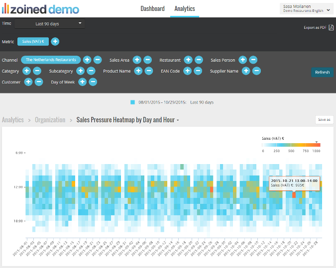
The analysis shows how the metric values such as sales are distributed to different times of day in the chosen time period creating a heatmap where higher metric values are shown with warmer colours (orange/red) and smaller metric values with cooler colours (light blue).
We still of course provide the traditional “Sales Pressure by Weekday and Hour” analysis as well where the focus is on distribution of sales pressure on weekday (by Monday, Tuesday..) and by hourly level. This older analysis report remains located in the same place with the new one at Zoined portal at Analytics/Organization, direct link below:
https://app.zoined.com/analytics/report/hourly-sales-pressure